This essay uses every ScrollStory component at least once: simple figures and footnotes, scrollyboxes and jumbotrons, background image switching, sticky backgrounds, side-scroll sections, juxtapose comparisons, and the full header system. Read it as a demonstration, or copy any piece of it straight into your own essay.
Notice the header above: it includes an eyebrow (“ScrollStory Demo”), a divider (the decorative line of symbols), and a subtitle below the title. These hero-only fields are set in the front matter:
header-eyebrow: ScrollStory Demo
header-divider: ✦ ✦ ✦
header-subtitle: every component, one essay
Auto-scroll: demo mode
This essay also has autoscroll: true in the page header–you may have noticed a little popup in the lower right of your screen–which enables a hands-free scrolling mode useful for demos and recordings. Anywhere on the page, press P to start auto-scrolling; press P again to pause. Scrolling manually, pressing Escape, or using arrow keys also pauses it.
Auto-scroll is off by default on all pages. To enable it, add autoscroll: true to a page’s metadat. Remove the line (or set it to false) to disable it.
All the Basics Still Work
.jpg)
Ferns on the forest floor. Simple figure-wrap, right-aligned at 48%.
The cinematic components do not replace the plain ones — you mix them. Simple images, footnotes, and section headings sit perfectly well beside the full-screen effects we’re about to show you.
The craft is in knowing when to use which. Not every moment needs a cinematic treatment. Sometimes a simple image alongside text is exactly right.
Juxtapose: Before/After Comparisons
Below you’ll see a juxtapose component—an interactive slider that lets readers compare two images by dragging a handle left and right.


Drag the slider to compare two forest scenes — mist vs. dappled light. The starting position is set to 35% so readers see more of the second image initially.
Why use juxtapose? When you want readers to actively explore the relationship between two images. The interactive slider invites engagement—readers control what they see.
Use cases: Historical photos showing change over time, different views of the same location, comparing maps or documents, revealing differences that might be subtle.
The starting-position="35%" shifts the slider so readers don’t start at the default 50/50 split.
Sticky Background
The sticky background is similar to a scrollybox but uses CSS position: sticky instead of background-attachment: fixed. The visual effect is subtly different — the image scrolls with you until it reaches the top of the viewport, then sticks while content continues past it.
Sticky background with right-aligned text box.
This works like a standard scrollybox but uses a different CSS technique. The image feels more grounded — it moves with the page before locking into place.
Use bg-sticky when:
- You want the image to arrive with the scroll rather than being revealed behind content
- You need more reliable behavior on mobile devices
- The sticky “lock-in” moment adds to your narrative
Center-Aligned Pull Quote
The pull quote above uses box-align=\"center\" and width=\"70%\" — wider and more prominent than a left- or right-aligned one. Reserve center-aligned quotes for your most important ideas.
Jumbotron, Two Ways
A jumbotron comes in two flavours, and overlay picks between them.
The first is a panel: the words sit on a band of solid colour that fades sideways to reveal the photograph. The page continues into the picture.
Autumn Canopy
A panel jumbotron. The band on the right is the page’s own colour, fading leftward to let the photograph through. box-align sets both which side the text takes and which way the gradient runs.
Panel mode — the words sit on the page, the picture arrives beside them.
The second lets the image run the full width, with the text over it on a sheer dark scrim. Nothing is hidden; the photograph is the point and the words are laid on top.
Into the Mist
An image jumbotron. The photograph is uninterrupted and the scrim only darkens enough to carry the text, which switches to a light colour to suit it.
Image mode — the picture is uninterrupted and the words sit on it.
Whenever you change bg-color, set text-color to match. The two are
independent, so a dark band with the default dark text is the one reliable way
to make a jumbotron unreadable:
A Dark Panel
Both the band colour and the text colour are stated here, because neither one implies the other.
A panel in a colour of your choosing, with the text colour set to suit it.
Markdown Blockquote
Markdown’s own > syntax is the recommended pattern in Xanthan for quoting a source. It keeps quotations readable in plain text and easy to style with CSS:
The forest floor receives only 2% of the sunlight that hits the canopy. What grows there has adapted to work with almost nothing — and yet the understory is where most of the forest’s biodiversity lives.
To change the visual texture, edit the blockquote rule in assets/css/typography.css. The Markdown stays simple; the design lives in CSS.
Standard Scrollybox
The next section uses a basic scrollybox. Keep scrolling to see text overlay a full-screen background image.
Looking up through the canopy — this scrollybox is right-aligned, using box-align: right.
All the same Markdown works inside a scrollybox. Use them freely alongside the more elaborate components.
Use above-box-space and below-box-space to control pacing — more space means slower, more contemplative scrolling.
Background Switching: Multiple Images
This is the component that makes a scrollstory truly cinematic. You’re about to scroll through a section where the background image switches multiple times as you read, creating a visual sequence that matches your narrative.
Watch carefully: The background starts with one image, then switches to a second, then a third. The text box stays visible throughout.
The first image — a foggy forest scene. This multi-section scrollybox opens with bg-multi-long.html, which sets the initial background. Content between here and the bg-multi-long-close.html tag appears in a text box that scrolls over the changing backgrounds.
Lorem ipsum dolor sit amet, consectetur adipiscing elit. Phasellus nec ante ligula. Nulla fringilla ligula sit amet nisl consectetur ultricies. Mauris ac tellus eu ante lobortis rhoncus non eu nisl.
SWITCH: Moss and Bark
The background just switched to moss on a log. Each bg-switch tag triggers a new background image when the reader scrolls past it. You can chain as many switches as your narrative needs.
Duis ut dui dolor. Integer eu lectus at tellus accumsan euismod eget a ligula. Morbi venenatis, elit eu varius fermentum, ligula est dictum massa, sit amet ullamcorper augue nisl ut nunc.
Lorem ipsum dolor sit amet, consectetur adipiscing elit. Phasellus nec ante ligula. Nulla fringilla ligula sit amet nisl consectetur ultricies. Mauris ac tellus eu ante lobortis rhoncus non eu nisl.
SWITCH: Looking Up
Now the canopy — three layers of the forest shown through three background switches. This technique works for:
- Spatial narratives (moving through a building, landscape, or archive)
- Temporal sequences (before, during, after)
- Evidence building (presenting multiple sources for one argument)
- Scale shifts (close-up → medium → wide)
Duis eros odio, fringilla et pulvinar vitae, eleifend quis elit. Sed eleifend lectus in bibendum elementum. Watch as the text box scrolls out of view, followed by the background fading away.
Back to Normal Flow
Notice how smoothly you transitioned from that immersive multi-image sequence back to regular essay format? Mixing intense and calm sections is what creates rhythm — and rhythm is what keeps a long scrolling essay readable.
Side-Scroll Section
The side-scroll component creates a different reading pattern: images appear inline with your text, breaking the vertical flow with full-width visuals.
We begin in the understory. The light here is filtered through layers of leaves above, and what reaches the ground arrives in moving patches rather than a steady wash. Every surface harbours something: fungi breaking down fallen wood, mosses covering rock, insects working their way through root systems.
Ferns unfurl from tight spirals called fiddleheads — one of the oldest plant forms on Earth, predating flowering plants by hundreds of millions of years. They thrive in shade that would starve most other plants, which is why they carpet ground the canopy has already claimed.
A side-scroll section pairs a column of text with an image that holds its place beside it. The image stays while you read, then releases when the text beside it runs out. Give each image enough text to scroll against and the section paces itself; give it too little and the image barely moves before the next one arrives.
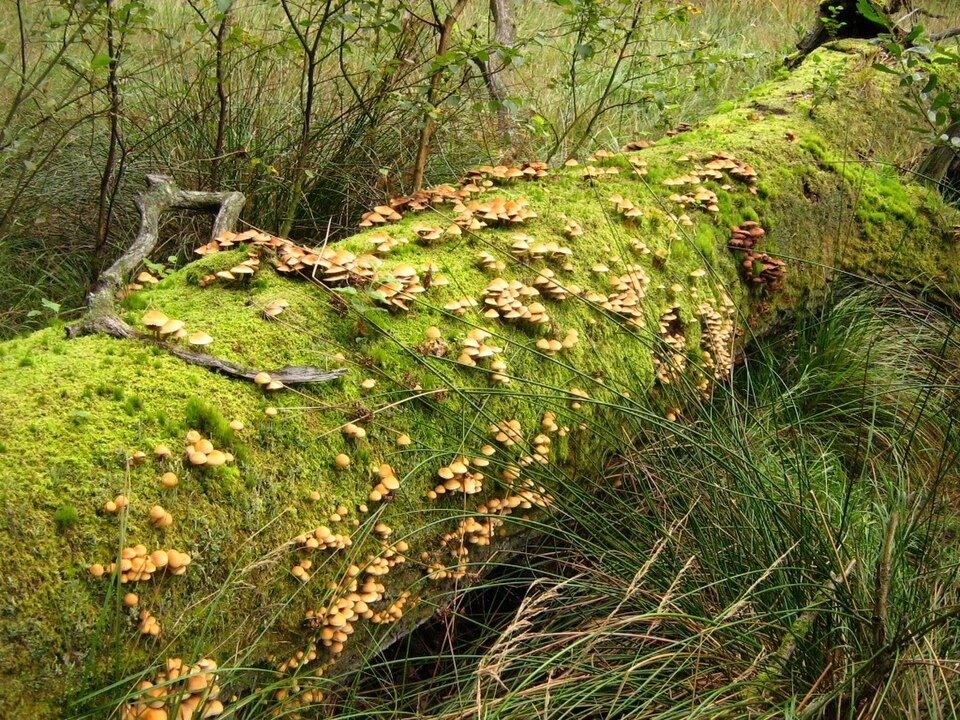
Deadwood is not an absence of life but a concentration of it. A standing trunk that has lost its crown becomes a vertical habitat: beetles bore in, woodpeckers follow the beetles, and the holes they leave behind become nests for birds that could not have made them.
Moss arrives once the bark has loosened enough to hold water. It is not taking anything from the wood — mosses have no roots to speak of — but its presence changes the surface, slowing evaporation and giving seeds somewhere to lodge that is neither bare wood nor open soil.
Standing deadwood and fallen deadwood decay along quite different schedules. A trunk still upright stays drier and can take a century to come apart; the same tree on the ground, in contact with soil and its fungi, may be gone in thirty years. Foresters count both as habitat and are careful to leave some of each.
This is the second image in the section, and it now has a text block of its own to move against. It is also the tallest of the three, so it needs slightly more text than its neighbours to travel the same distance — worth remembering when your own images are not all the same shape.
.jpg)
A fallen tree becomes a nurse log — decomposing over decades, feeding the soil, hosting new seedlings along its length. Nothing in a forest is wasted; it is only moved from one account to another, on a schedule measured in decades rather than seasons.
Look along the top of a nurse log and you will often find a row of saplings growing in a line, all the same age. They germinated on the raised surface because it lifted them clear of the leaf litter and gave them light the forest floor could not. Decades later, when the log has gone entirely, those trees are still standing in that line.
The side-scroll pattern suits this kind of sequential observation: walk, look closely, reflect, walk again. It works because each stop gets the same amount of attention — which, in layout terms, means each image gets a comparable block of text beside it.
Image Carousel With Full Options
Here’s a carousel with titles and captions:
-
Ferns Ancient plant forms thriving in filtered light. -
Nurse Log Decomposition feeds the next generation. -
Autumn Canopy The canopy transforms with the seasons. -

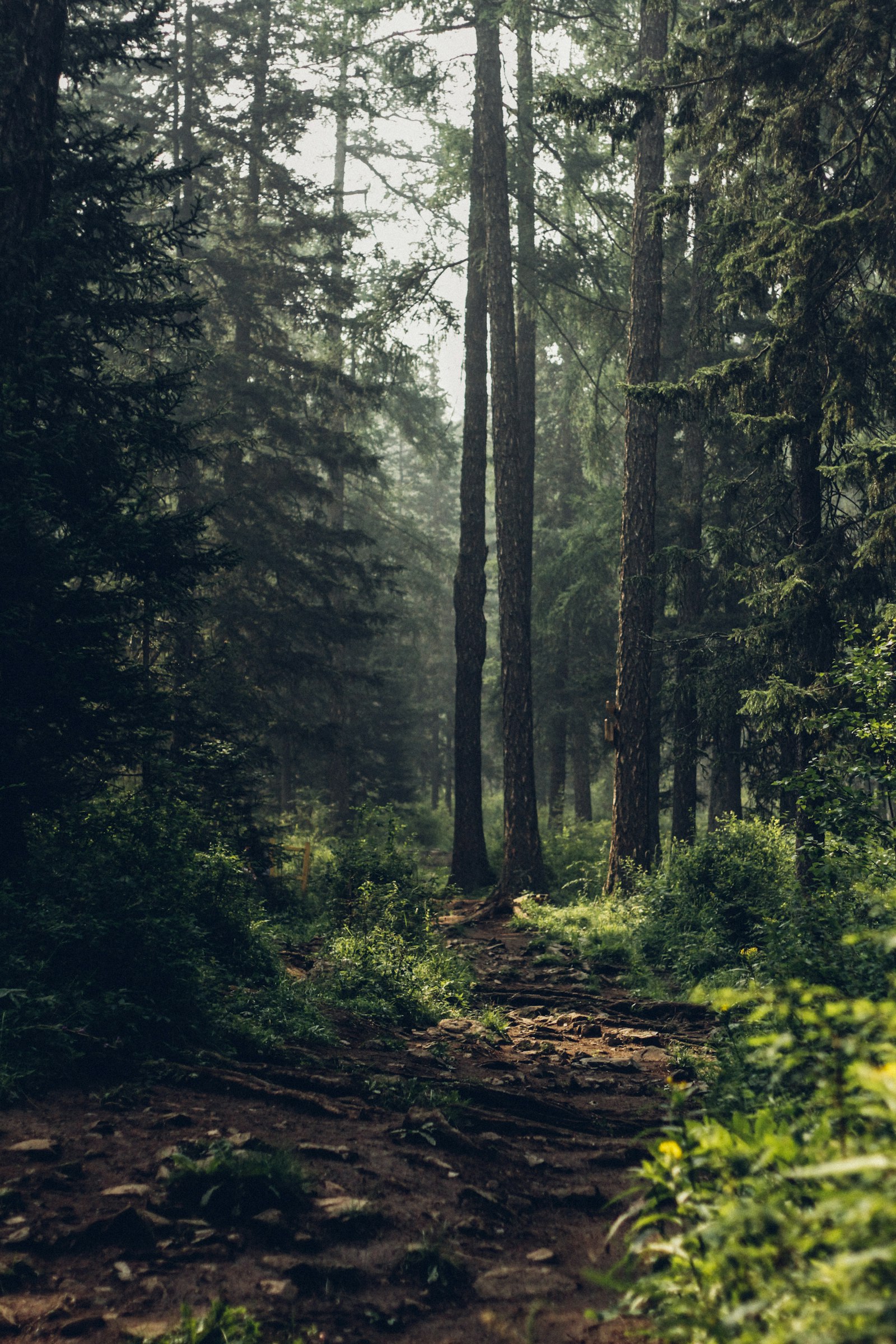
Morning Mist Mist softens the boundaries between trees.
What You’ve Learned
- Basic images and typography — Images (figure + figure-wrap), headings, footnotes, pull quotes, block quotes, alert boxes
- Fancier scrolling images full-width images — Scrollyboxes (bg.html), carousels, jumbotrons, pacing control
- Additional features:
- Juxtapose interactive comparisons with custom starting position
- Sticky backgrounds (bg-sticky)
- Background switching with multiple images (bg-multi-long + bg-switch)
- Side-scroll sections (bg-ss + bg-ss-image + bg-ss-close)
- Center-aligned pull quotes and Markdown blockquotes styled with CSS
- Header eyebrow, divider, and subtitle fields
- Auto-scroll for demos
You’ve seen most of the Xanthan toolkit. Not every essay needs every feature, but you now have complete control over how to tell visual stories on the web.
Feeling overwhelmed? You do not have to use all of this. Delete whole sections until what is left is the essay you actually want, then add components back one at a time. There is nothing special about this page — it is an ordinary Markdown file that happens to call a lot of components.
Ready to Create Your Own?
Start with the Getting Started guide to create your own site first. Once you have a working site, come back here to build your ScrollStory.