Images & Media
An image is never just decoration. It establishes credibility, creates a sense of place, shows something that words can’t, or gives a reader a moment to breathe between ideas. How you place an image shapes how it functions—whether it commands the full page, sits beside an argument, or anchors a section.
Xanthan gives you a small set of placement tools, each suited to a different editorial intention. That’s deliberate: rather than infinite options that require infinite decisions, you have a few choices that each do something well. Knowing what each one does is how you choose intentionally.
Stand-alone images
Use the figure.html include to place a single image in your content. It’s always centered and sits on its own—it gets its own visual moment, and whatever follows starts cleanly below it. You decide how big it is with image-width.
{% include images/figure.html
  image-width="60%"
  caption="What a nice view"
  alt-text="Hiking trails winding through a canyon in the Sandia foothills."
  image-path="/assets/images/backgrounds/hike-1.jpg"
%}
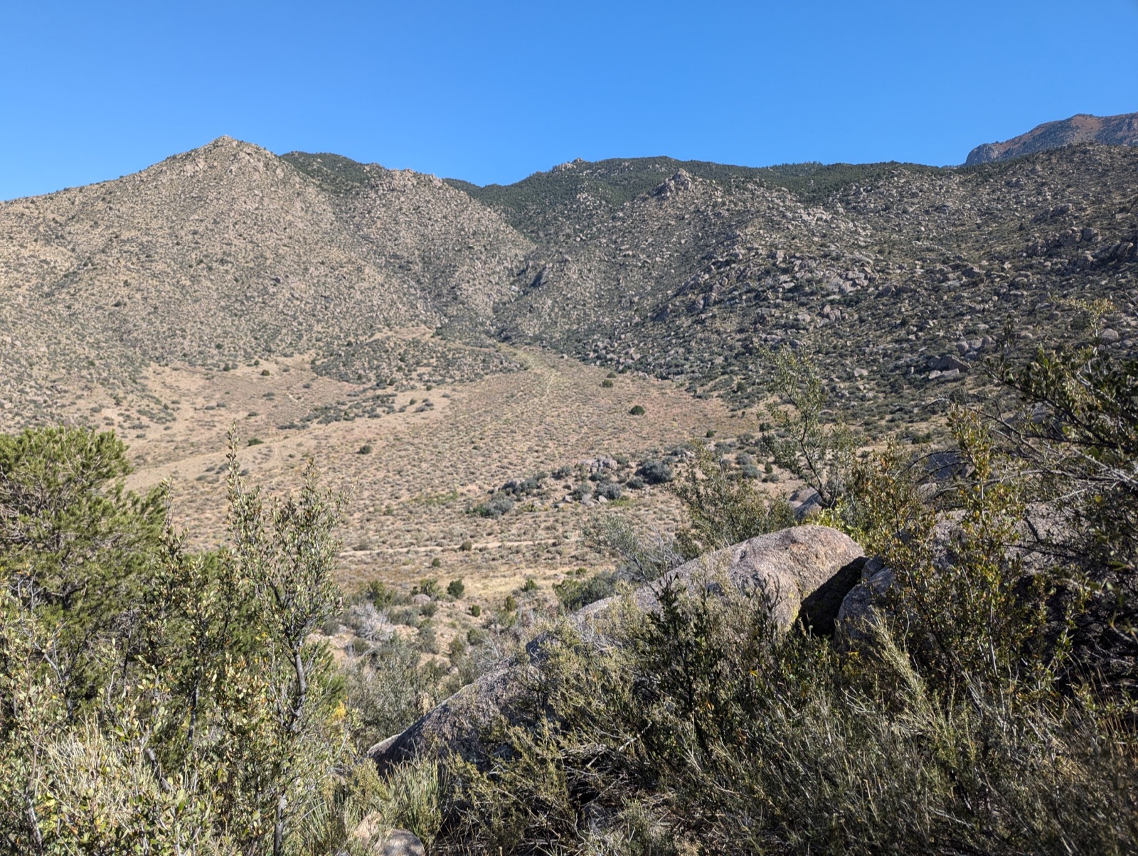
What a nice view
Choosing a width
image-width accepts any CSS width. Two common choices:
Full-width (image-width="100%") — the image commands the entire content column. The most common choice for photographs, maps, or anything that deserves full attention. Make sure your source image is at least 1200px wide to avoid looking grainy.
A full-width image commands the full content column.
A smaller centered width — good when the image doesn’t need to fill the full column, or when a smaller image would look lost at full width.
Centered at 60% width.
When you want an image beside text rather than above or below it, use figure-wrap.html—the recommended tool for pairing an image with text. See Image alongside text below; that’s also how you offset an image to one side of the page.
Parameters
| Parameter | Options | What it does |
|---|---|---|
image-path |
File path | Path to the image file |
image-width |
Any CSS value (40%, 300px) |
Width of the image (default: 40%) |
caption |
Text | Caption displayed below the image |
alt-text |
Text | Accessibility description (falls back to caption) |
Image alongside text
Sometimes an image and a passage of text belong together as equals—neither subordinate to the other, both necessary to the point. Use figure-wrap.html to place them side by side as an explicit two-column pair.
{% include images/figure-wrap.html
  image-path="/assets/images/backgrounds/hike-1.jpg"
  caption="What a nice view"
  alt-text="Hiking trail through a canyon in the Sandia foothills."
  image-position="right"
  image-width="45%"
  text="The text you put here sits beside the image, not below it. Good for introductory paragraphs, a key argument tied to a specific image, or whenever the visual and the words need to be read together. Content that follows the include starts at full width below both columns."
%}
What a nice view
The text you put here sits beside the image, not below it. Good for introductory paragraphs, a key argument tied to a specific image, or whenever the visual and the words need to be read together. Content that follows the include starts at full width below both columns.
The design forces a useful editorial question: which text belongs paired with this image? That’s a decision worth making deliberately.
Image on the left
With image-position omitted (or set to left), the image sits on the left:
Left-aligned image at 35% width. The text column takes the remaining space. Markdown is supported in the text parameter—bold, italic, links, and even line breaks.
Long text stays in its column
When the text is longer than the image is tall, it continues in the text column—it does not flow underneath the image. Whatever comes after the include starts at full width below both columns.
This paragraph is long enough to extend past the bottom of the image. Notice that the text stays in its own column throughout—it doesn’t wrap under the image the way a floated image would behave. The two columns are independent. When the text runs long, the image column simply ends at the image bottom and leaves empty space below it. This is predictable, intentional behavior: you know exactly what you’re getting. The content that follows this include will start at full width, below the taller of the two columns.
This is content after the figure-wrap. It starts at full width below both columns.
Parameters
| Parameter | Options / Default | What it does |
|---|---|---|
image-path |
(required) | Path to the image file |
text |
(required) | Text beside the image; supports Markdown |
caption |
(none) | Caption below the image; supports Markdown |
alt-text |
Falls back to caption | Accessibility description for screen readers |
image-position |
left (default), right |
Which side the image appears on |
image-width |
40% (default) |
CSS width of the image column |
On small screens, the layout collapses to a single column with the image on top.
Both image includes share image-width, so sizing works the same way whether an image stands alone or sits beside text. image-position is unique to figure-wrap—a standalone figure.html image is always centered, so there’s no side to choose.
Alt-text
Jumbotron images
A jumbotron breaks out of the page’s content column to fill the full browser width—the most cinematic option available. Use one as a visual break between sections, or add a text overlay. The gradient fade is applied automatically so text reads cleanly against the image.
{% include images/jumbotron.html
  image-path="/assets/images/backgrounds/pano-1.jpg"
  height="50vh"
  box-align="left"
  title="Optional heading"
  text="A pull quote or caption on the clear side of the image."
  background-position="center right"
%}
Optional heading
A pull quote or caption on the clear side of the image.
No text or fade
If you omit text and title, the gradient is skipped and the jumbotron renders as a clean full-width visual break—useful as section dividers on long pages.
{% include images/jumbotron.html
  image-path="/assets/images/backgrounds/pano-1.jpg"
  height="30vh"
  background-position="center 60%"
%}
Heading, zoom, and custom fade
Use zoom to enlarge the image and fade-start/fade-end to control how quickly the gradient appears and disappears.
Landscape at dusk
{% include images/jumbotron.html
  image-path="/assets/images/backgrounds/pano-1.jpg"
  height="50vh"
  box-align="right"
  title="Landscape at dusk"
  zoom="150%"
  background-position="center left"
  fade-start="10%"
  fade-end="80%"
%}
Parameters
| Parameter | Default | What it does |
|---|---|---|
image-path |
(required) | Path to image |
height |
40vh |
CSS height, e.g. 50vh or 400px |
box-align |
left |
left, right, or center — text position and gradient direction |
title |
(none) | Heading above the text |
text |
(none) | Body text; supports Markdown. Gradient applied automatically when present |
zoom |
cover |
CSS background-size; e.g. 150% to zoom in |
background-position |
center |
CSS background-position; aim the subject away from the text side |
fade-start |
0% |
Where the opaque gradient begins |
fade-end |
60% |
Where the gradient becomes fully transparent |
bg-color |
var(--bg-page) |
Color of the opaque side; matches page background by default |
caption |
(none) | Caption below the image; supports Markdown |
box-align controls both text placement and gradient direction:
box-align |
Text position | Gradient |
|---|---|---|
left (default) |
Left side | Opaque left → transparent right |
right |
Right side | Opaque right → transparent left |
center |
Centered over image | No gradient; text shadow used for legibility |
Header images
A header image is a large banner across the top of the page, set in the front matter rather than in the content body:
---
title: My Page Title
layout: default
header-image: /assets/images/backgrounds/pano-1.jpg
---
Controlling height and position
---
title: My Page Title
layout: default
header-image: /assets/images/backgrounds/pano-1.jpg
header-height: 50vh
header-position: center
---
| Field | Default | What it does |
|---|---|---|
header-height |
40vh |
Height of the header (e.g. 50vh, 300px) |
header-position |
(browser default) | Which part of the image to show (center, top, 200px, 50% 80%) |
header-position is particularly useful when you have a large image but only a specific part—the sky, the bottom half—is what you want visible in the header crop.
Before/after slider (Juxtapose)
Compare two images with a draggable slider—ideal for historic vs. contemporary photos, before/after transformations, or any visual comparison where the reader should be able to move between the two states themselves.
{% include images/juxtapose.html
  image1="/scrollstories/forest/images/mvh-tv-room.jpg"
  image2="/scrollstories/forest/images/mvh-hist-common-room.jpg"
  caption="The TV room becomes the History Department Common Room."
%}
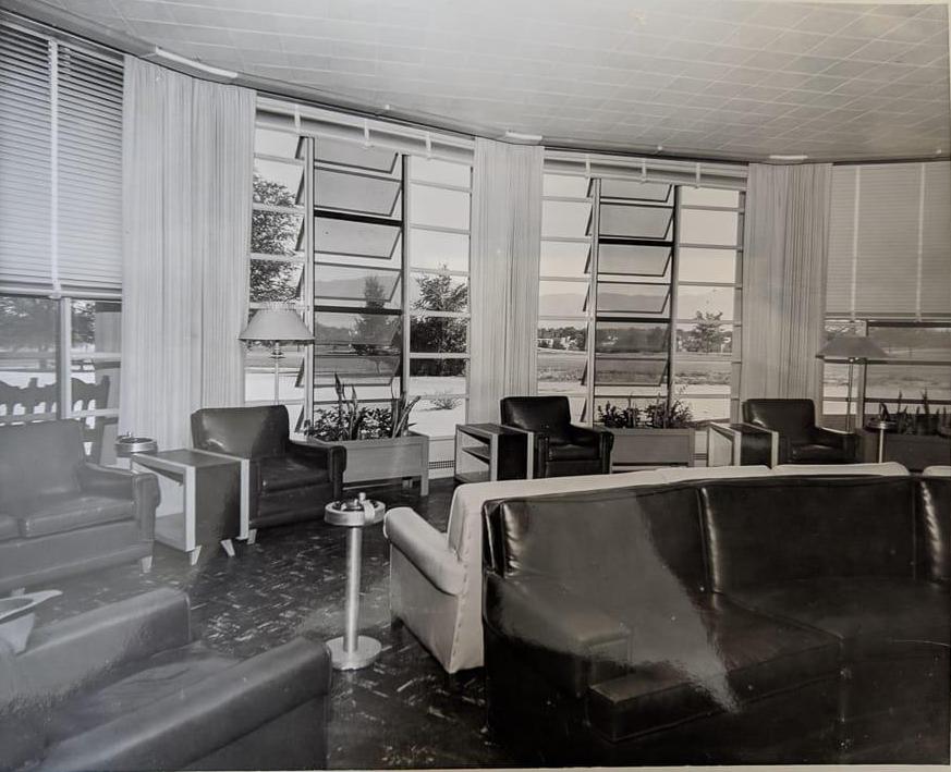
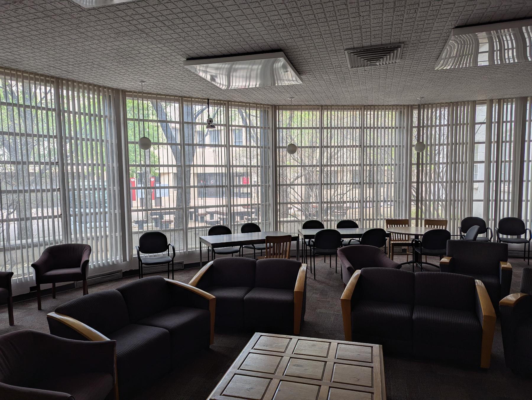
From the TV room to the Chair room (actually, the History Department Common Room). With a less good view of the mountains.
| Parameter | What it does |
|---|---|
image1 |
Path to the first (left) image |
image2 |
Path to the second (right) image |
caption |
Optional caption below the slider |
starting-position |
Where the slider starts (default: 50%) |
The effect is most striking when the two images are taken from the same vantage point.
Image carousel
Display a series of images as a slideshow. Define three lists (images, headers, captions) and pass them to the carousel include:
{% assign images =
"/scrollstories/forest/images/mvh-construction.jpg,
/scrollstories/forest/images/mvh-room-cost.jpg,
/scrollstories/forest/images/mvh-tv-room.jpg" | split: ','
%}

{% assign headers =
"A Photo Title,,
No caption here" | split: ','
%}

{% assign captions =
"It's useful to have informative captions|
This image has a caption, but no title|
" | split: '|'
%}

{% include images/carousel.html
  width="80%"
  class="center"
  images=images
  headers=headers
  captions=captions
%}
-
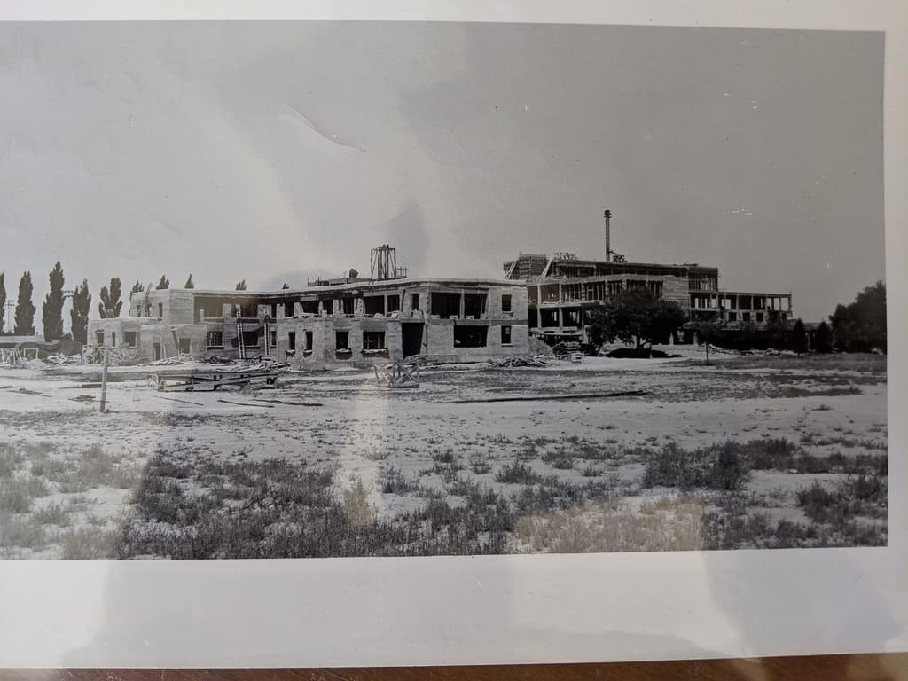
A Photo Title It's useful to have informative captions -
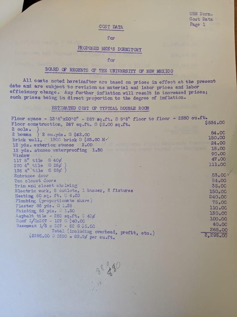
This image has a caption, but no title -
No caption here
| Parameter | What it does |
|---|---|
width |
Width of the carousel (default: 100%) |
class |
Alignment: left, center, right |
id |
Unique ID if you have multiple carousels on one page |
images |
List of image paths |
headers |
List of slide titles (use empty values for no title) |
captions |
List of slide captions (split on \| to allow commas in text) |
ScrollStory images
For more cinematic image effects, ScrollStories offer techniques where images stay fixed while text scrolls over them, backgrounds switch as the reader advances, and panels slide horizontally alongside fixed visuals. These go beyond standard image placement into full narrative design.
See the ScrollStories overview to learn what’s available, or jump directly to Peekaboo images for a parallax-style reveal effect that works on any page.
Making your images smaller
A photograph straight from a phone or a museum download is often 4000 pixels wide and several megabytes. Nothing on a web page needs that, and a page full of them is slow to open on a phone — which is where a good share of your readers are. Shrinking them changes nothing a reader can see.
You do not need a command line for this. Your site ships with a job that does it for you:
- Go to the Actions tab of your repository on GitHub
- Choose Optimize Images in the left-hand list
- Click Run workflow, and check the settings:
| Setting | What it means |
|---|---|
| Folder | Which folder to work through. assets/images covers your site’s shared images; an essay’s own folder works too, like essays/my-essay/images, and . does the whole site |
| Longest edge | The biggest either side is allowed to be. 1600 suits a full-width image; use 2400 for something meant to be looked at closely |
| Quality | JPEG quality out of 100. 85 is a good default. Below about 70 you start to see it |
| Actually change the files | Leave this unticked the first time |
- Click the green Run workflow button
The first run changes nothing. It reports what it would do — file by file, with the size before and after — in the run summary. Read that, and if the numbers look right, run it again with Actually change the files ticked.
When it runs for real it commits the smaller images for you, and your site rebuilds a minute or two later. Your originals are still in the repository’s history if you ever want them back.
It also converts PNGs to JPGs where that saves a lot and the image has no transparency — photographs saved as PNG are often several times larger than they need to be. When it does, it updates the references to match — in your pages, data files and stylesheets — so nothing breaks.
If you do work at a command line, the same thing runs locally:
bash scripts/optimize-images.sh --preview --recursive --base-dir assets/images
Drop --preview to apply it. bash scripts/optimize-images.sh --help lists the
rest of the options.
Troubleshooting
Embedding media
Beyond images, you can embed audio, video, and 3D models. In most cases you copy an “embed code” from a service like YouTube or SketchFab and paste it onto your page. For a few formats Xanthan provides an include so the markup stays standardized and easy to maintain.
Sound files
To embed a sound file with a simple playback interface, use the audio.html include and set src to the path of your file.
{% include media/audio.html
  src="/assets/audio/sample-audio.mp3"
%}
Embed codes from other services
For YouTube, Vimeo, SketchFab, and similar services, copy the embed code the service gives you and paste it directly into your page. It will render as-is.
Image doesn’t appear:
- Check that the file path and filename match exactly (paths are case-sensitive)
- Verify the image file has been committed to your repository
- Make sure the path starts with
/for absolute paths or is correct relative to the current page
Image looks grainy or stretched:
- Use images large enough for the display width (at least 1200px wide for full-width images)
- JPG works well for photographs; PNG is better for diagrams or screenshots with text
Header image not showing:
- Ensure
header-imageis in the front matter block (between the---lines), not in the page content - Check the path carefully—it should start with
/
For more help, see Troubleshooting.