Forest
The kitchen sink of demos. This essay showcases every ScrollStory component — background switching, sticky backgrounds, side-scroll sections, juxtapose comparisons, and more.
As a site grows beyond a handful of pages, navigation becomes an argument about what matters and how things relate. Xanthan provides several navigation systems—from a top menu bar to auto-generated card directories to interactive maps—and you can combine them freely. A class project might use a top navbar for site-wide structure, cards on a landing page, a left sidebar for browsing essays, and a map for geographic context.
The horizontal menu at the top of every page is controlled by a single YAML file: _data/nav-top.yml. No HTML, no coding—just a structured list of titles and URLs.
- title: "About"
  url: "/about"

- title: "Research"
  items:
    - title: "Overview"
      url: "/research/"
    - title: "Current Projects"
      url: "/research/current"
    - title: "Publications"
      url: "/publications"

- title: "Contact"
  url: "/contact"
This creates three menu entries: a direct link to About, a Research dropdown with three items, and a direct link to Contact.
Dropdown menus group related pages under a label:
- title: "Research"
  items:
    - title: "Overview"
      url: "/research/"
    - title: "Publications"
      url: "/publications"
Direct links go straight to a page with no dropdown:
- title: "About"
  url: "/about"
Horizontal lines inside a dropdown help organize long menus:
- title: "Content"
  items:
    - title: "Typography"
      url: "/reference/typography"
    - title: "Images"
      url: "/reference/images"

    - divider: true

    - title: "Previewing Locally"
      url: "/reference/working-locally"
The top menu is controlled by one data file, _data/nav-top.yml.
. on your repository page to open the browser editor_data/nav-top.ymlAdd a link to an existing menu — just add another - title: / url: pair under items:, matching the indentation (4 spaces):
- title: "Research"
  items:
    - title: "Overview"
      url: "/research/"
    - title: "Datasets"
      url: "/datasets"
Create a new dropdown — add a new top-level entry with items::
- title: "Teaching"
  items:
    - title: "Courses"
      url: "/teaching/courses"
    - title: "Advising"
      url: "/teaching/advising"
Remove a menu — delete the entire block, from - title: through all its items:.
Rename a menu — just change the title: text. The URL stays the same.
For pages on your site, always start with /:
url: "/about"              # Correct
url: "/essays/tutorial"    # Correct
url: "about"               # Wrong - missing /
url: "about.md"            # Wrong - don't include .md
For external sites, use the full URL:
url: "https://github.com/your-project"
URLs map directly to your file structure: essays/tutorial.md becomes /essays/tutorial. Folders with an index.md use a trailing slash: projects/index.md becomes /projects/.
items: should be indented exactly 4 spaces.title: "Text" works; title:"Text" breaks.If your navigation disappears after an edit, paste your file into a YAML validator to spot syntax errors.
- title: "About"
  url: "/about"

- title: "Research"
  items:
    - title: "Overview"
      url: "/research/"
    - title: "Current Projects"
      url: "/research/current"
    - title: "Publications"
      url: "/publications"

- title: "Teaching"
  items:
    - title: "Courses"
      url: "/teaching/courses"
    - title: "Advising"
      url: "/teaching/advising"

- title: "Contact"
  url: "/contact"
Cards turn a list of items into a visual directory—title, summary, optional image, and a link. There are three card layouts and two ways to supply the data.
The most direct way to understand cards: write the data in your page’s front matter and see exactly what each field becomes when rendered.
---
title: Readings
layout: default
cards:
  - title: "River Systems and Settlement"
    summary: "How waterways shaped the geography of early towns along the Rio Grande."
    link: "#"
    position: 1
  - title: "Acequia Landscapes"
    summary: "Community irrigation networks and their role in shaping land use patterns."
    link: "#"
    position: 2
  - title: "Mining Towns and Their Aftermath"
    summary: "The boom-and-bust cycles that defined the built environment of the mountain West."
    link: "#"
    position: 3
---
In the page body, assign that list to a variable and pass it to a card include:
{% assign my_cards = page.cards %}
{% include cards/card-toc.html rows = my_cards %}
How waterways shaped the geography of early towns along the Rio Grande.
This approach is well-suited for curated reading lists, external links, or any collection where you don’t need a full page for each item. You control exactly what appears and in what order.
If your items are actual pages on your site, you can gather them automatically from a folder instead of listing them individually:
{% assign card_pages = site.pages | where_exp: "page", "page.path contains 'essays/'" %}

{% include cards/card-toc.html rows = card_pages %}
Change essays/ to whatever folder your pages live in. where_exp collects every page whose path contains that string. As you add or edit pages in the folder, the cards update automatically—no maintenance required.
Each page controls its own card through its front matter:
---
title: River Towns
author: Carlos Medina
summary: How waterways shaped the geography of early towns along the Rio Grande.
thumbnail: images/river-card.jpg
position: 1
tags:
  - settlement
  - water
---
You don’t configure the cards—you configure the pages.
The same data can render in several different collection layouts. Swap the include file to change the style.
Compact text rows with a right-arrow. No images required. Best for long lists, reading indexes, or any collection where images aren’t necessary.
{% include cards/card-toc.html rows = card_pages %}
Wide horizontal cards with the image on the left. Good when images help readers recognize items before clicking.
{% include cards/card-stack.html cards = card_pages %}
Vertical cards in a grid, image on top. Works well for galleries or when the image is the primary identifier.
The kitchen sink of demos. This essay showcases every ScrollStory component — background switching, sticky backgrounds, side-scroll sections, juxtapose comparisons, and more.

Perfect for beginners getting comfortable with Markdown and digital essays. Section headings, a few images, pull quotes, and footnotes. Nothing fancy, but enough to make a visually compelling essay.
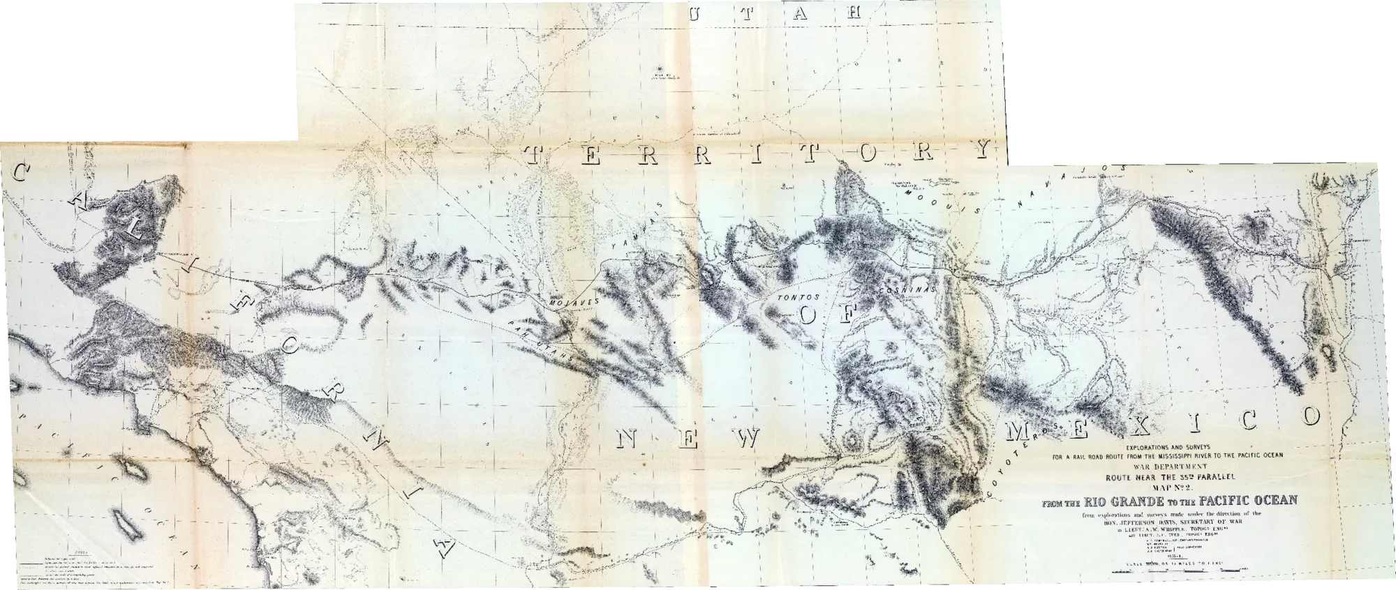
A story map demo: a pack-mule route from Santa Fe to Los Angeles, drawn over the government survey that helped replace it.
A transformation of a wall-mounted museum exhibit into a dynamic webpage.
{% include cards/card-grid.html cards = card_pages %}
Use the gallery grid when the image is the main way readers choose where to go. It is still navigation: each tile links to a page or external item. Use variant="uniform" when every item should have the same visual weight; use variant="mosaic" only when varied tile sizes are part of the editorial design. Titles stay visible over the image, while summaries reveal on hover or keyboard focus.
{% include nav/gallery-grid.html items = card_pages %}
These fields are read from each page or data item to populate the card:
| Field | Used by | What it does |
|---|---|---|
title |
All | Required. The card heading. |
summary |
All | Short description. Stack and Grid also try description, then auto-excerpt. |
thumbnail |
Stack, Grid, Gallery Grid | Path to the card or gallery image. |
position |
All | Sort order. Lower numbers appear first. |
tags |
Stack, Grid | Tag pills at the bottom of the card. |
alt-text |
Gallery Grid | Optional image alt text. If absent, the title is used. |
link |
All | Override URL. Useful for external links. If absent, uses url. |
card-toc.html — text-only rows:
| Parameter | What it does |
|---|---|
rows |
The list of page or data objects to display |
card-stack.html — horizontal image-left cards:
| Parameter | Default | What it does |
|---|---|---|
cards |
(required) | The list of page or data objects to display |
show-tags |
true |
Whether to show tag pills |
tag-data |
false |
Add data-tags attributes for JavaScript tag filtering |
card-class |
— | Additional CSS class added to each card |
card-grid.html — vertical image-top grid:
| Parameter | Default | What it does |
|---|---|---|
cards |
(required) | The list of page or data objects to display |
show-tags |
true |
Whether to show tag pills |
tag-data |
false |
Add data-tags attributes for JavaScript tag filtering |
grid-class |
— | Additional CSS class on the grid wrapper |
nav/gallery-grid.html — image-first linked mosaic:
| Parameter | Default | What it does |
|---|---|---|
items |
(required) | The list of page or data objects to display |
variant |
mosaic |
Use mosaic for varied tile sizes or uniform for equal tiles |
min-width |
180px |
Minimum tile width before the grid wraps |
gap |
var(--spacing-xs) |
Space between image tiles |
image-field |
thumbnail |
Front matter field to use for the image |
show-title |
true |
Whether to show titles over images |
show-summary |
false |
Whether to show summaries over images |
class |
— | Additional CSS class on the gallery wrapper |
The left sidebar provides persistent navigation for all pages in a folder, visible while reading any page in that section. Useful for course projects, documentation, or any collection where readers need to jump between related pages.
See the left nav demo to see this layout in action.
1. Set the layout in each page’s front matter:
---
layout: nav-left
title: Your Page Title
---
2. Define navigation sections in _data/nav-sections.yml:
sections:
  - name: essays
    display: "Student Essays"
  - name: resources
    display: "Resources"
3. Assign pages to sections using toc-section and order:
---
layout: nav-left
title: River Towns
toc-section: essays
order: 3
---
Pages are automatically grouped by toc-section and sorted by order.
Edit assets/css/nav-left.css to change sidebar width (default: 25vw), colors, fonts, or spacing.
_layouts/nav-left.html          # Layout template
_data/nav-sections.yml          # Section configuration
assets/css/nav-left.css         # Sidebar styling
_includes/nav/nav-left.html     # Navigation component
The profile sidebar layout displays a personal card on the left—photo, name, bio, and links—with page content on the right.
See the profile sidebar demo to see this layout in action.
A sidebar earns a permanent column when a reader needs what is in it while reading any page. A profile usually is not that: it is the thing you say once, on the way in. And on a phone the sidebar stacks above the content anyway, which makes it an opening block — one that pushes your actual homepage text below the fold.
The Profile Intro component says the same thing at full width, at the top of the homepage, and leaves every page its whole column. It reads the same _data/nav-profile.yml described below, so you can try both without moving any content. The Portfolio template opens with it.
Use the sidebar when your links really do belong on every page. Use the intro block otherwise.
Set the layout in your page’s front matter:
---
layout: nav-profile
title: Your Page Title
---
Configure the sidebar in _data/nav-profile.yml:
settings:
  links_font_weight: normal

image_url: /assets/images/profile/profile-sample.jpg
alt_text: "Description of your photo"
name: Your Name
description: A brief bio or tagline

links:
  - title: Website
    url: https://example.com
    icon: fas fa-globe
  - title: GitHub
    url: https://github.com/username
    icon: fab fa-github
  - title: Email
    url: mailto:you@example.com
    icon: fas fa-envelope
The sidebar uses Font Awesome icons:
| Icon | Code |
|---|---|
| Website | fas fa-globe |
| GitHub | fab fa-github |
fas fa-envelope |
|
| Twitter/X | fab fa-twitter |
fab fa-linkedin |
|
| ORCID | fab fa-orcid |
| University | fas fa-university |
The map component draws a marker for any page with geographic coordinates, and builds the popup out of that page’s own front matter. A page joins the map by gaining coordinates and leaves it by losing them, so the map is never a second list to keep in step with the first.
Include geo and (optionally) placename in the page’s front matter:
---
title: Seedling
geo: [37.88, -81.08]
placename: New River Gorge National Park
summary: Perfect for beginners getting comfortable with digital essays.
header-image: images/seedling-card.png
---
The popup shows the page’s thumbnail (falling back to header-image), its
title as a link, the placename, and the summary.
{% include nav/map.html
  height="600px"
  class="map-wrap--wide"
%}
With no opening coordinates, the map opens on the view that fits every marker it found — which is usually what you want, and never wrong the way a hardcoded centre goes wrong the moment the content moves.
| Parameter | Default | What it does |
|---|---|---|
folder |
every page | Map only the pages under this folder, e.g. "objects" |
fields |
— | Front matter fields to print in the popup under the place name, comma-separated, e.g. "object-date,medium,collection" |
image-field |
thumbnail |
Front matter field holding the popup image, falling back to header-image |
id |
"map" |
Unique ID (needed for multiple maps on one page) |
height |
700px |
CSS height |
width |
100% |
CSS width |
class |
— | Extra classes on the map’s wrapper. map-wrap--wide breaks out of the text column |
start-coords |
fits the markers | Opening center point as "[lat, lng]" |
zoom |
8 |
With start-coords, the opening zoom; without it, the closest the automatic fit may go (1–18, higher = closer) |
A collection site usually wants its objects on the map and not its essays.
folder limits the markers to one part of the site, and fields says which
of the catalogue facts already in the front matter each popup should carry:
{% include nav/map.html
  folder="objects"
  fields="object-date,medium,collection"
  class="map-wrap--wide"
  height="70vh"
%}
A page missing one of those fields prints the rest. If nothing under the folder has coordinates yet, the component says so on the page rather than rendering an empty grey box.
[lat, lng] in your front matter| Level | View |
|---|---|
| 4–6 | Country or region |
| 10–14 | City |
| 15–18 | Street level |
For long pages, a scrollspy table of contents creates a floating sidebar that tracks your reading position. It automatically generates links from all h2 headings on the page.
{% include nav/scrollspy-toc.html %}
Add this line near the top of your page content (after the front matter). The TOC will appear as a sticky panel on the right side of the page, highlighting the current section as you scroll.
Breadcrumbs show the current page’s location in the site hierarchy:
{% include nav/breadcrumbs.html %}
This renders a trail like: Home > Research > Current Projects
These systems are modular—use them together. A typical class project might combine:
The top nav is site-wide (controlled by nav-top.yml). Everything else is page-level—add or remove it from individual pages as needed.
Workshop mode is a presentation feature built for instructors and students who want to walk through a page’s content one bullet point at a time. When active, list items are revealed incrementally using keyboard shortcuts—useful for class discussions where revealing everything at once kills the conversation.
Toggle it by pressing W or clicking the workshop checkbox in the top navigation bar. Once active, pressing the right arrow or space bar advances to the next bullet; left arrow steps back. The feature works on any page, no configuration required.
Workshop mode is not intended for end users of your site. It’s a live-presentation convenience for the person running the session. The toggle does not appear in print or in exported PDFs.